



TL;DR
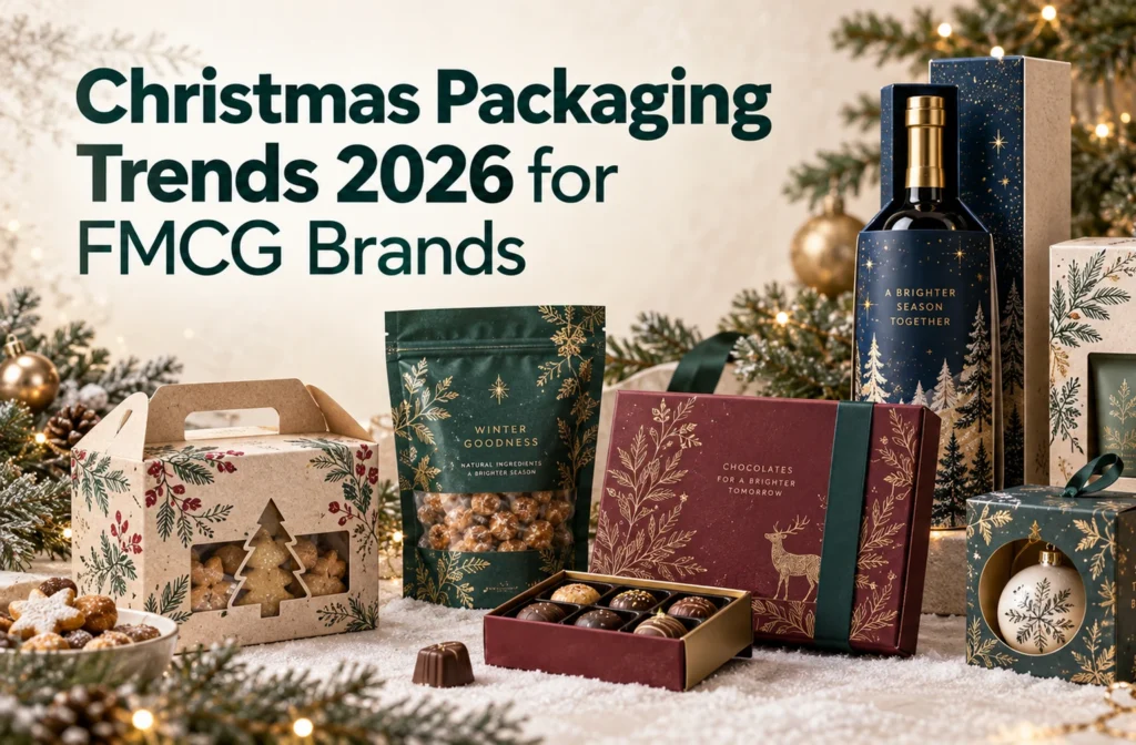
Christmas packaging in 2026 is moving beyond saturated red-and-green graphics toward muted seasonal palettes, handcrafted details, restrained luxury, verifiable sustainability, and packaging designed for specific sales channels. FMCG brands do not need to abandon familiar Christmas cues or complete a full redesign: the strongest approach is to preserve recognizable brand assets, adapt colors and graphics to the product category, and use different packaging structures for retail shelves, ecommerce delivery, and gifting.
Regional expectations should also shape the design direction. North American packaging often prioritizes shelf impact, personalization, inclusive holiday language, and ecommerce performance; UK designs can draw on heritage, nostalgia, and traditional food gifting; EU packaging requires simpler structures, multilingual information, and clearer sustainability communication; Japan and East Asian markets favor compact, refined, locally validated gift formats; while Australia and New Zealand offer opportunities for summer palettes, native botanicals, and outdoor seasonal imagery instead of conventional winter scenes.
Traditional Christmas packaging tends to rely on a familiar visual formula: Christmas red, evergreen, gold, snowflakes, ribbons, and Santa Claus. But when food, beverage, and beauty brands all use the same seasonal elements, simply making a package “look Christmassy” is no longer enough to stand out on a retail shelf or ecommerce page.
In December 2025, Pantone named the soft white Cloud Dancer 11-4201 its Color of the Year for 2026. Earlier, WGSN and Coloro selected Transformative Teal, a blend of dark blue and aquatic green, as their 2026 Color of the Year. Compared with the saturated reds and greens typically associated with Christmas, these colors feel quieter, more natural, and more restrained.
For FMCG brands researching Christmas packaging trends 2026, this shift creates an opportunity to move beyond layered holiday symbols and use more distinctive colors, materials, graphics, and structures. This guide explores five trends for food, beverage, beauty, personal care, and other consumer packaged goods, along with the products, packaging formats, channels, and markets they suit.
Christmas Packaging Trends 2026 at a Glance
| 2026 Christmas packaging trend | How it changes traditional holiday packaging | Best FMCG categories | Recommended formats |
|---|---|---|---|
| Muted Christmas color palettes | Rebalances traditional red and green with warm white, teal, deep blue, and muted red | Chocolate, beverages, beauty, personal care | Folding cartons, labels, flexible packaging, gift boxes |
| Handcrafted holiday graphics | Replaces generic snowflakes and trees with hand-drawn graphics, collage, and natural textures | Bakery, coffee, tea, artisan foods | Paper bags, sleeves, labels, food boxes |
| Quiet-luxury gift packaging | Moves from black-and-gold excess to whitespace, embossing, and restrained metallic details | Premium food, alcohol, beauty, fragrance | Rigid boxes, drawer boxes, bottle boxes, gift sets |
| Verifiable sustainable packaging | Replaces green-looking design with material reduction, specific claims, and clear disposal guidance | Food, household goods, private-label products | Paperboard cartons, corrugated boxes, paper inserts |
| Channel-specific Christmas packaging | Gives retail and ecommerce packaging distinct structures instead of forcing one format across channels | DTC, subscription, cross-border, and retail brands | Mailer boxes, corrugated cases, window boxes, sleeves |
These trends do not require brands to abandon the reds, greens, and seasonal graphics consumers already recognize. A more practical approach is to retain enough visual shorthand to signal Christmas, then use color, illustration, material, and structure to create differentiation.
Five Christmas Packaging Trends for FMCG Brands in 2026
1. Look Beyond Traditional Christmas Red and Green
Traditional Christmas packaging design often uses saturated red and evergreen, supported by bright gold, snowflakes, or ribbons. These colors are highly recognizable, but they also create a problem: when neighboring brands use the same palette, shoppers may notice “Christmas packaging” before they recognize the brand behind it.
The change for 2026 is not about removing red and green completely. It is about reducing their saturation and visual dominance, then bringing in warm white, deep blue, teal, burgundy, and natural neutrals.
Cloud Dancer can replace a standard bright white as a softer packaging background, paired with deep green, burgundy, or a limited amount of gold. In Pantone’s guidance on using Cloud Dancer in packaging, the color is positioned as a foundation for a refined, modern, premium aesthetic that allows the product and brand to remain prominent.
Transformative Teal can serve as a contemporary alternative to evergreen. It maintains a connection to nature while introducing a cooler blue undertone, making it especially relevant to wellness foods, functional beverages, skincare, fragrance, and products with a sustainability-led positioning.
The ESPA 2025 Christmas packaging collection provides a useful example. The brand moved away from the previous year’s festive reds and decorative motifs, unifying the collection with deep royal blue, fine embossing, metallic foil, and consistent structural details.
This trend works well for folding cartons, drawer boxes, multiproduct gift boxes, bottle labels, coffee cups, and seasonal sleeves. It is particularly suitable for chocolate, candy, coffee, tea, holiday beverages, beauty, and personal care products.
For smaller brands, completely replacing an established color system for Christmas may weaken existing product recognition. A safer approach is to retain one core brand color and add one or two seasonal accent colors, creating a festive effect without making the product look like a different brand.
2. Add a Human Touch to Counter Generic AI Aesthetics
In the past, Christmas packaging often relied on standardized snowflakes, Christmas trees, reindeer, candy canes, and gift icons. These elements communicate the season quickly, but repeated use can also make packaging feel generic.
As AI packaging design tools become more common, similar gradients, lighting effects, compositions, and illustration styles may become easier to recognize. The opportunity for 2026 is not to reject AI, but to add visible signs of human authorship to the final design.
Starbucks’ 2025 holiday cup designs drew inspiration from the red and green aprons worn by its baristas, using ribbons, plaid, and coffeehouse textures. Its EMEA holiday campaign extended that direction with graphics inspired by cup doodles and handwritten names, connecting the campaign to ordinary, human interactions.
[Insert Image: Starbucks hand-drawn holiday design reference]
This simpler, more hand-rendered design language softens the standardized appearance of a large chain and adds warmth and playfulness to its Christmas identity.
FMCG brands can take inspiration from their products, ingredients, production processes, or brand stories. A coffee brand might illustrate roasting and brewing, a cookie brand could draw the baking process with deliberately irregular lines, and a tea company could develop seasonal graphics from plants associated with its growing region.
Other elements to consider include:
- Handwritten typography and personalized messages
- Collage, paper-cutting, and stamped effects
- Screen-print, woodcut, or printmaking textures
- Uncoated paper, kraft paper, and visible natural fibers
- Borders and graphic arrangements that are not perfectly symmetrical
This trend is particularly well suited to baked goods, chocolate, coffee, tea, condiments, craft beverages, and independent personal care products. It works naturally across paper bags, labels, flexible packaging, folding cartons, and seasonal sleeves.
However, a handmade look should not interfere with information hierarchy. Product names, flavors, sizes, and logos must remain legible, especially in crowded food and beverage categories.
3. Build Luxury Through Restraint
Traditional luxury Christmas packaging often depends on black, bright gold, large foil areas, magnetic closures, and multiple layers of inserts. These choices can create an immediate sense of luxury, but they can also make a package feel heavy, expensive, and overbuilt.
A more relevant direction for 2026 is warm quiet luxury: fewer colors and decorative elements, with greater attention to proportion, whitespace, paper texture, and a small number of carefully selected finishes.
ESPA’s deep-blue Christmas collection demonstrates this approach. Instead of relying on complex red-and-green graphics, the range uses a unified color system, fine embossing, metallic foil numbers, and consistent structures. Color holds the collection together, while paper and finishing create tactility and gift appeal.
For SMBs with limited packaging budgets, a premium seasonal pack does not always require a completely new rigid box. Brands can improve the presentation of existing packaging by:
- Keeping the current folding carton and adding a seasonal sleeve
- Adding an embossed logo, textured paper, or small metallic detail
- Using warm white, cream, deep blue, or muted green
- Reducing front-panel copy and reorganizing information
- Improving the insert and product arrangement
As McKinsey’s analysis of packaging as a performance and value driver explains, packaging decisions affect more than customer experience. They also influence materials, manufacturing, logistics costs, margins, and revenue. Premium packaging therefore needs to be evaluated as a complete system, not only as a visual concept.
Before ordering physical samples, brands can use Packify’s luxury Christmas packaging design tool to explore color, typography, embossing, and gift-box directions, then compare how each concept changes the perceived value of the product.
Premium chocolate, wine, spirits, perfume, and fragrance are especially well suited to this style. Recommended formats include two-piece rigid boxes, drawer boxes, folding gift cartons, bottle boxes, and multiproduct gift sets.
Effective luxury packaging is not defined by using the most materials. It comes from making sure every color, finish, and structural choice has a clear purpose.
4. Make Sustainability Visible and Verifiable
Sustainable packaging has often been communicated through kraft paper, green graphics, or illustrations of leaves. But these visual cues do not prove that a package performs better environmentally.
The change for 2026 is to make sustainability understandable and verifiable. Brands need to turn “green” from an aesthetic into specific information about materials, structure, and disposal.
The FTC Green Guides advise marketers against making broad, unqualified claims such as “green” or “eco-friendly,” because those claims are difficult to substantiate. Claims involving recycled content, recyclability, or compostability should identify the relevant material, percentage, and conditions.
For Christmas packaging, practical improvements may include:
- Removing unnecessary packaging layers
- Reducing empty space around the product
- Using materials that are easier to separate and sort
- Replacing some plastic inserts with paper-based structures
- Reducing plastic windows, laminates, glitter, and mixed-material decorations
- Stating the percentage of recycled material
- Explaining how each packaging component should be disposed of
- Avoiding environmental claims that cannot be verified
In Lush’s explanation of its gift packaging materials, the brand describes using postconsumer paper, recovered plastic bottles, and textile offcuts. It also offers reusable fabric wrapping and uses plant-starch packing peanuts for cushioning.
This approach shows that sustainable Christmas packaging does not have to eliminate color, illustration, or gift appeal. The material selection, reuse method, and disposal guidance simply need to support the environmental message printed on the package.
A 2025 McKinsey packaging survey covering 11 countries found meaningful differences in how consumers across markets prioritize sustainable packaging and express willingness to pay for it. Brands should therefore adapt sustainability claims to local waste systems and consumer expectations rather than using identical messaging everywhere.
For companies selling into the European Union, these changes also have practical regulatory value. According to the European Commission’s guidance on the Packaging and Packaging Waste Regulation, the PPWR entered into force in February 2025 and generally begins to apply in August 2026. It addresses packaging reduction, recyclability, labeling, reuse, and unnecessary empty space in ecommerce and transport packaging.
Sustainable packaging cannot be added after the visual design is complete. Materials, inserts, packaging layers, and information areas need to be evaluated during the structural and graphic design process.
5. Design for Retail Shelves and Ecommerce Separately
Brands have often used the same Christmas package for physical retail and ecommerce. But packaging designed for shelf presentation may not withstand parcel delivery, while a protective corrugated shipping box may not attract shoppers in a retail environment.
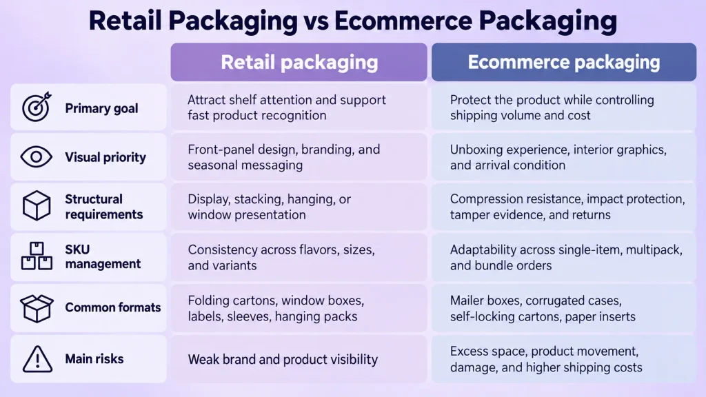
The ASDA 2025 Christmas food packaging redesign demonstrates the priorities of retail packaging. A consistent red palette, gold star, and typography system brought previously disconnected seasonal products together as a recognizable shelf range.
Ecommerce packaging needs to prioritize different questions: Will the product move in transit? How will fragile items and bottles be secured? Can the shipping case protect the printed inner package? Will excess dimensions increase void fill and transportation costs?
In McKinsey’s example of ecommerce beauty packaging, disconnected packaging decisions can result in an oversized corrugated shipper, disposable protective fill, a premium presentation box, and additional nonrecyclable materials around the primary container. The issue is not too little packaging, but a lack of coordination between packaging layers.
Retail and ecommerce versions can share colors, typography, illustration, and seasonal graphics to reduce duplicated design work and preserve brand consistency. Their structures, however, should be developed around the requirements of each channel.
Once the channel has been defined, food, confectionery, beauty, and personal care brands can use Packify’s Christmas box design tool to explore folding cartons, gift boxes, and ecommerce-ready structures while comparing different seasonal graphic directions.
Christmas ornaments create an additional challenge because their packaging must support display, shipping protection, and storage after the holidays. Glass baubles, ceramic ornaments, and irregularly shaped decorations often require individual compartments, folded paper restraints, or molded inserts.
Etsy sellers, gift brands, and ornament businesses can use Packify’s Christmas ornament packaging design tool to generate packaging concepts and explore directions based on product dimensions. Before production, the insert design, material thickness, and structural strength should still be checked with the packaging supplier.
Good ecommerce Christmas packaging does more than create a pleasant unboxing moment. It also helps the product arrive intact without adding unnecessary materials, volume, or shipping costs.
Christmas Packaging Design by Country and Region
Businesses selling into the United States, Canada, the United Kingdom, the European Union, East Asia, Australia, and New Zealand should plan their Christmas packaging early.
In many of these markets, the year-end period is an important retail and gifting season. In the United States, for example, the National Retail Federation forecast 2025 holiday sales of between $1.01 trillion and $1.02 trillion, exceeding $1 trillion for the first time.
For FMCG and CPG brands, this creates opportunities to turn standard food, beverage, beauty, and personal care products into limited editions, bundles, and gift sets. However, seasonal expectations, language, colors, and cultural symbols vary by market.
Localized packaging can make a product feel more relevant to familiar holiday settings, reduce cultural mismatches, and strengthen its presentation on shelves and ecommerce pages.
Regional Christmas Packaging Summary
| Target market | Recommended design direction | Key considerations | Suitable FMCG products |
|---|---|---|---|
| United States and Canada | Strong shelf recognition, personalization, classic Christmas and inclusive holiday design | Ecommerce presentation, shipping protection, seasonal language, environmental claims | Candy, beverages, beauty, subscription boxes |
| United Kingdom | Heritage, nostalgia, hand-drawn graphics, traditional food gifting | Preserve brand recognition and avoid generic retro styling | Cookies, tea, chocolate, alcohol |
| European Union | Minimal design, natural materials, muted colors | Multilingual information, packaging reduction, empty space, recyclability | Food, beauty, household goods, private label |
| Japan and East Asia | Compact, detailed, limited-edition, multiproduct packaging | Local gifting habits, seasonal context, cultural validation | Confectionery, beauty, beverages, lifestyle products |
| Australia and New Zealand | Summer Christmas, brighter colors, local botanicals | Seasonal context, temperature, shipping conditions | Beverages, food, beauty, outdoor products |
| Multimarket brands | Modular design with replaceable regional elements | Language, regulation, recycling information, cultural symbols | Cross-border FMCG products |
United States and Canada
In North America, brands need to choose between explicitly Christmas-focused language and the broader term holiday packaging, depending on the audience and campaign.
Traditional red and green remain highly recognizable in retail, but younger brands can introduce blue, pink, warm white, or more personalized visual elements.
Confectionery, beverages, beauty products, and DTC gift sets also need to account for ecommerce presentation, limited-edition messaging, and shipping protection. Brands targeting a broader year-end audience can retain winter colors and gift cues while reducing their dependence on explicitly religious imagery.
When making packaging claims such as “recyclable,” “compostable,” or “eco-friendly” in the United States, brands should also review the evidence and qualifications required by the FTC Green Guides.
United Kingdom
Heritage, nostalgia, and traditional food gifting can work particularly well in the UK market.
Hand-drawn winter botanicals, historic streetscapes, plaid, printmaking, and classic typography are natural fits for cookies, tea, chocolate, preserves, alcohol, and Christmas hampers.
Brands still need to retain their logos, signature colors, or core graphics. Overreliance on nostalgic Christmas imagery can make otherwise distinct brands look similar.
Food companies with multiple SKUs can establish a shared seasonal typeface, border, and supporting graphic system, then use product photography and flavor colors to differentiate each item.
European Union
EU packaging can benefit from a simpler, more natural, and information-led design direction that also supports material separation.
Brands can use uncoated paper, warm white, muted colors, and paper-based inserts while reserving enough space for multilingual product information, material labels, and disposal guidance.
When entering several EU countries, the main structure and brand system can remain consistent while labels or sleeves carry local languages, regulatory information, and recycling instructions.
Because the PPWR generally begins to apply in August 2026, brands planning Christmas products for Europe should evaluate packaging layers, empty space, recyclability, and information requirements early in the design process.
Japan and East Asia
Christmas shopping habits vary significantly across East Asian markets, so one country’s packaging approach should not be treated as representative of the entire region.
Confectionery, beauty, beverage, and lifestyle products can explore compact gift boxes, drawer structures, multiproduct sets, and detailed limited-edition graphics. Rather than directly reproducing Western Christmas imagery, brands should understand how local audiences respond to gifting, refinement, playful design, and seasonal exclusivity.
International brands should confirm which channels use Christmas imagery, when seasonal products are sold, and who typically receives them. Copy density, colors, and graphics should also be validated by local teams or target consumers.
Australia and New Zealand
Christmas falls during summer in Australia and New Zealand, so packaging does not need to revolve entirely around snow, fireplaces, and heavy winter colors.
The Primepac Australia holiday packaging guide recommends coral, turquoise, mint, and soft gold for a summer Christmas direction. Eucalyptus, sunshine, coastal settings, and outdoor gatherings can also replace the pine forests and snow scenes commonly used in Northern Hemisphere packaging.
Beverages, sun care, seasonal foods, and products for outdoor gatherings are particularly suited to this direction. Shipped food, cosmetics, and candles may also require testing for the effects of summer temperatures on both products and packaging materials.
How to Choose the Right Christmas Packaging Trend
When choosing a Christmas packaging trend, the first question should not be, “What is popular this year?” A better starting point is identifying which products need stronger seasonal packaging and what the product, channel, market, and budget can realistically support.
Which Products Need Better Christmas Packaging?
The following product types often benefit most from a seasonal packaging review:
| Product type | Why it needs stronger packaging | What to consider |
|---|---|---|
| Gift sets assembled from standard products | The package needs to turn everyday products into a complete gift | Product arrangement, visual consistency, inserts, opening sequence |
| Chocolate, cookies, and premium foods | Packaging must support preservation, display, and gifting | Food contact, ingredients, shelf life, sealing |
| Wine, spirits, and bottled beverages | Products are heavy and may move during shipping | Neck restraint, base protection, labeling, load strength |
| Beauty and personal care sets | Sets often contain containers of different sizes | Product hierarchy, inserts, ingredients, order of use |
| Christmas ornaments | Glass and ceramic products are easily damaged | Individual compartments, restraint, post-holiday storage |
| Ecommerce exclusives | Packaging must withstand parcel delivery | Empty space, cushioning, tamper evidence, unboxing, returns |
| High-value limited editions | Packaging needs to support a higher perceived value | Materials, finishes, structure, production cost |
Before selecting a trend, confirm the product’s dimensions, weight, fragility, shelf-life requirements, regulatory information, and shipping conditions. Trends can improve appeal, but they cannot replace protection, storage, or clear product communication.
Match the Packaging to the Sales Channel
Different sales channels require different packaging priorities.
| Sales channel | Primary design goal | What to consider | Suitable packaging formats |
|---|---|---|---|
| Retail shelves | Attract attention and support fast product recognition | Front-panel information, shelf dimensions, SKU consistency, barcodes, merchandising | Folding cartons, window boxes, labels, sleeves, hanging packs |
| Ecommerce | Protect products while controlling shipping volume | Empty space, cushioning, tamper evidence, surface protection, unboxing, returns | Mailer boxes, corrugated cases, self-locking cartons, paper inserts |
| Corporate gifting | Create a personalized and complete gifting experience | Logo customization, messages, product arrangement, lead times | Rigid boxes, drawer boxes, two-piece boxes, gift sets |
| DTC and subscription | Improve unboxing and social sharing | Interior printing, brand story, product sequence, repeat-shipping costs | Mailer boxes, subscription boxes, folded inserts, cards |
| Cross-border sales | Adapt one packaging system to multiple markets | Languages, regulatory labels, shipping distance, climate | Modular boxes, replaceable sleeves, localized labels |
Retail and ecommerce versions can share the same colors, typography, and illustration system while using different structures. Corporate gifts can add customized sleeves, recipient labels, and seasonal cards to an existing packaging format instead of requiring a complete packaging run.
Corporate gifts also often need a personalized message alongside the product packaging. Brands can use Packify’s Christmas card generator to create a card that matches the gift box’s colors, graphics, and tone, then add a client name, company logo, or localized greeting.
For international campaigns, the primary packaging can remain consistent while the card language and regional message change. This reduces the complexity of designing and producing separate packaging systems for every market.
Refresh Stable Packaging Instead of Starting Over
If the existing package already has strong brand recognition, a complete Christmas redesign may create unnecessary risk.
Changing the logo position, brand colors, information hierarchy, and packaging structure at the same time can make the product harder for returning customers to recognize. It may also increase the risk of obsolete packaging inventory, higher printing costs, and delayed seasonal launches.
A safer approach is to retain the following brand assets:
- Logo and primary placement
- Core brand colors
- Product name
- Flavor or variant identification
- Required product claims
- A proven packaging structure
The seasonal redesign can then focus on accent colors, limited-edition illustrations, sleeves, labels, seals, or Christmas cards.
Brands can use Packify’s packaging redesign feature to upload their current packaging, identify the elements that must remain unchanged, and test new Christmas colors, illustrations, and campaign graphics around the existing identity.
For example:
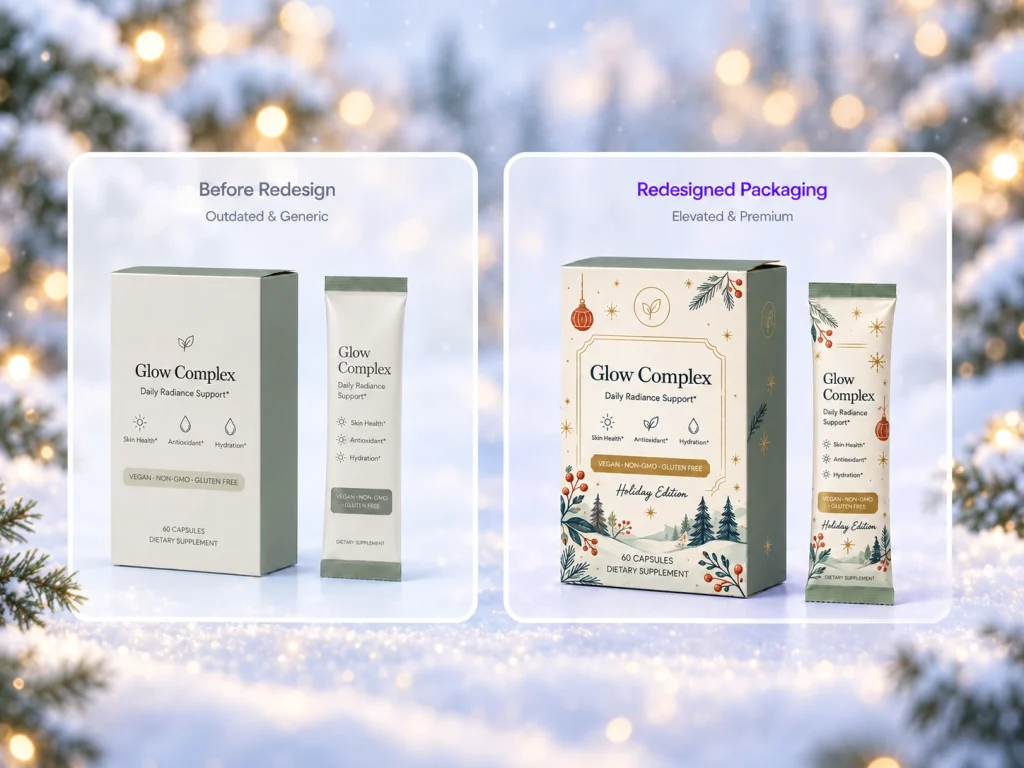
Keep the existing logo, product name, core brand color, and packaging structure. Change the accent colors to Cloud Dancer and Transformative Teal, add subtle hand-drawn Christmas botanicals, and make the overall layout more restrained and premium.
After generating several directions, the brand can compare the original and revised packages, check whether the logo, product name, and flavor remain easy to recognize, and then decide whether the concept is ready for sampling.
Packify is best used for early concept development, packaging redesign, direction comparison, mockup creation, and dieline generation. Before mass production, the packaging supplier should still verify dimensions, bleed, fonts, CMYK color settings, material thickness, paper grain, print finishes, and structural performance.
The leading Christmas packaging trends 2026 do not require FMCG brands to abandon red, green, or familiar holiday imagery. The real shift is away from saturated colors and decorative excess and toward more restrained palettes, human-made graphics, verifiable sustainability, and packaging structures designed for specific sales channels.
For SMBs, the strongest option is often not a complete overhaul. A targeted seasonal packaging refresh can preserve brand recognition while introducing a more distinctive Christmas color, illustration, sleeve, card, or gift-box experience.
By choosing a direction that fits the product, channel, and regional market—and using Packify to test luxury Christmas packaging, Christmas boxes, ornament packaging, and redesign concepts—brands can move more quickly toward a seasonal design that is both visually relevant and ready for production review.